Key takeaways
- The median is the middle test when all tests are lined up from slowest to fastest. Half are slower, half are faster.
- p25 is the speed a quarter of tests fall below; p75 is the speed a quarter of tests beat. Between them is the middle half.
- Two places can share a median and still feel very different. The gap between p25 and p75 shows the spread.
- County speed cells publish only at 20 or more tests in 6 months, excluding tests with more than 1% obstruction.
- Compare with Starlink's plan ranges carefully: Residential Max is stated as up to 400+ Mbps download; the 200 and 100 Mbps plans are capped.
On this page
- The three numbers, one at a time
- Why not just show the average?
- Same median, very different evenings
- Comparing with Starlink’s plan ranges
- What makes a published speed cell trustworthy
- Common mistakes
- Reading upload and latency the same way
- Comparing your own tests with a county cell
- Why we don’t publish a “top speed” or a speed score
- What we don’t know
- What to do next
- Questions people ask
- Sources
On a Starlink speed page, the median is the middle result when every test is lined up from slowest to fastest, p25 is the speed a quarter of tests fall below, and p75 is the speed a quarter of tests beat. The range from p25 to p75 is the middle half of all tests: a typical test lands somewhere in it. Read the median for “what’s normal here” and the p25 to p75 gap for “how much it varies.”
We show those three numbers instead of a single average because one number hides the slow tail, and the slow tail is usually what people are asking about. Below: how to read each number, an illustration with made-up tests, why two places with the same median can feel different, and how to compare with Starlink’s plan ranges.
The three numbers, one at a time
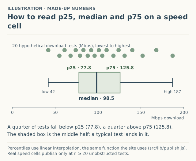
Take 20 hypothetical download tests, sorted: 42, 55, 61, 68, 74, 79, 83, 88, 92, 96, 101, 105, 110, 118, 124, 131, 140, 152, 168, 187 Mbps.
| Number | Value (illustration) | How to say it |
|---|---|---|
| Lowest | 42 Mbps | The single worst test |
| p25 | 77.8 Mbps | One test in four was slower than this |
| Median | 98.5 Mbps | Half the tests were slower, half faster |
| p75 | 125.8 Mbps | One test in four was faster than this |
| Highest | 187 Mbps | The single best test |
With 20 tests, the median falls between the 10th and 11th (96 and 101), so it’s 98.5. The p25 and p75 values fall between tests too; the site uses linear interpolation, the standard way to place a percentile between two neighbors. You don’t need to do this math: every published cell shows the three numbers and the count, n.
Why not just show the average?
The average adds everything up and divides. In the illustration it’s about 104 Mbps, a bit above the median, because the few fast tests (152, 168, 187) pull it up. Replace the 187 with a freak 900 Mbps result and the average jumps to about 139, while the median stays 98.5.
The question most readers bring is “what will a normal evening look like?” The median answers that and resists odd results. The p25 answers the follow-up: “how bad do the bad tests get?”
Same median, very different evenings
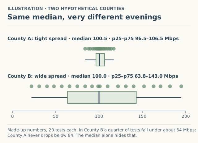
| Hypothetical county | p25 | Median | p75 | What it feels like |
|---|---|---|---|---|
| A (tight spread) | 96.5 | 100.5 | 106.5 | About the same every time |
| B (wide spread) | 63.8 | 100.0 | 143.0 | Great sometimes, slow sometimes |
If you only saw “median 100 Mbps,” you’d think they were the same. The p25 tells you that one test in four in County B is under 64 Mbps. For video calls in the evening, that’s the number that matters.
A wide spread often has a time-of-day story. Starlink says peak hours are “typically between 6pm and 11pm local time,” when “you may experience varying or slower speeds.” Our report form records the time band of each test so evening and morning results can eventually be compared directly; see time of day.
Comparing with Starlink’s plan ranges
Starlink publishes typical ranges for US Residential plans (from its support pages, verified October 5, 2026):
| Plan | Typical download | Typical upload |
|---|---|---|
| Residential Max | up to 400+ Mbps | 20–40 Mbps |
| Residential 200 Mbps (select areas) | 80–200 Mbps, capped at 200 | 15–35 Mbps |
| Residential 100 Mbps (select areas) | capped at 100 Mbps | 15–35 Mbps |
| Roam | not published | not published |
Three cautions when you put a county cell next to these:
- Plans mix in county cells. A county median can include tests from all three Residential plans. A median of 95 Mbps might be mostly capped 100 Mbps customers, not slow Max service. Our upload and download page explains the plan ranges further.
- “Up to” is a ceiling statement. Residential Max is stated as “up to 400+ Mbps.” It isn’t a promise for the median.
- The 200 Mbps plan has a stated lower end. Starlink says its typical download is 80–200 Mbps and that it “may be slower at peak” than Residential. If your own tests on that plan sit well below 80 most of the time, that’s worth looking into.
What makes a published speed cell trustworthy
- n ≥ 20. A county shows speeds only after at least 20 tests in the last 6 months. Fewer, and it says “not enough reports yet” (why).
- Obstructed tests excluded. Tests with more than 1% app-reported obstruction are kept in raw data but not counted, because a blocked dish and a congested area look the same on a speed test.
- The date range is shown. If all 20 tests are from one week, that’s visible on the cell.
- Self-reported. Every cell says “self-reported, not verified by Starlink.”
As of October 5, 2026, no county had reached 20 tests. Speed pages are live so you can see how cells will look, and so readers can start adding tests.
Common mistakes
- Treating the median as a guarantee. Half of all tests are below it, by definition.
- Comparing your best test to the county median. Compare a typical test, ideally the middle of three (how to test).
- Ignoring n. A median from 21 tests is much less certain than one from 210. Every cell shows its n.
- Comparing an evening test to a morning median. Use the same time band.
- Blaming the network for an obstructed dish. Check the app’s obstruction result first.
Reading upload and latency the same way
Every published speed cell has three rows, download, upload and latency, each with p25, median and p75. Two of them read differently:
| Measure | Better is | How to read p25 and p75 |
|---|---|---|
| Download (Mbps) | Higher | p25 is the slow end; one test in four was below it |
| Upload (Mbps) | Higher | Same as download. Starlink’s Residential upload ranges are 20–40 Mbps (Max) and 15–35 Mbps (200 and 100 Mbps plans) |
| Latency (ms) | Lower | Flipped: p75 is the bad end; one test in four had higher (worse) latency than p75 |
The latency flip catches people out. For video calls and gaming, the p75 latency is the number that describes the laggy evenings.
Comparing your own tests with a county cell
- Run at least three tests with the checklist, and take the middle one.
- Match the time band. Compare an evening test with evening data where it’s available.
- Place your result between the numbers. Below p25: you’re in the slowest quarter of tests in your county. Between p25 and p75: typical. Above p75: the fastest quarter.
- Check the n and the dates. A cell with n = 21 from one month is a rough guide; n = 200 over six months is steadier.
- If you’re consistently below p25, rule out the house-level causes (obstruction, Wi-Fi, other devices) before concluding anything about the network. Causes ranked by evidence lists them.
Why we don’t publish a “top speed” or a speed score
Some speed maps show the fastest result in an area or a single score. We don’t, for three reasons:
- The fastest test describes the luckiest moment. In our illustration the top test was 187 Mbps while the median was 98.5. Leading with the maximum would oversell every county.
- A single score hides the spread. County B in Figure 2 would get the same median-based score as County A, despite being slower one test in four.
- Speed is three things. Download, upload and latency matter for different uses. A video call cares about upload and latency as much as download.
So every published cell shows the same five things: n, the date range, and p25, median and p75 for each measure. It’s more to read, but each number answers a question people actually ask.
What we don’t know
- Any county’s real p25, median or p75. All numbers on this page are illustrations. Real cells appear only at n ≥ 20.
- How much of the spread is time of day versus plan versus setup. The form records time band, tool and obstruction %, which will let us separate some of it once there’s data. Plan isn’t recorded for speed tests at the tier level.
What to do next
- Run a test that can be compared: how to run a Starlink speed test that counts.
- Read why speeds differ between places in causes ranked by evidence.
- Our reading the data page covers p25 and p75 alongside the other things that trip people up.
- Add your test. We ask for your county, never your address.
Questions people ask
What does p25 mean in a speed test result?
Why use the median instead of the average speed?
What is a good spread between p25 and p75?
Why does my speed test differ from the county median?
How many tests does a county need before you show speeds?
Sources
- Starlink support: What are the Residential plans? (modified Apr 8, 2026) (retrieved Oct 6, 2026)
- Starlink support: What is the Residential 200 Mbps service plan? (modified Apr 9, 2026) (retrieved Oct 6, 2026)
- Starlink support: Slow Speeds - Outside/During Peak Hours (modified Apr 9, 2026) (retrieved Oct 6, 2026)
Related guides
Speeds
How to run a Starlink speed test that counts
Run a Starlink speed test you can compare: what to pause, which test to use, why three runs, which time band, the obstruction check, and what to record.
Speeds
Why Starlink speed varies by location: causes ranked by evidence
Why Starlink is faster in one place than another: peak demand, local capacity, plan caps, obstructions, Wi-Fi and location, each with how well it's documented.
Method
Why “not enough reports yet” is an answer, not a gap
Why a hatched county on our Starlink surcharge and speed maps shows no number until 5 reports (or 20 speed tests), and why a guessed number would be worse.